15 Kitchen Wallpaper Inspiration Ideas for Every Style – Nancys Home

Standing in a paint shop holding chips of Muted Sage and Warm Stone, I once thought colour alone would be enough to fix my kitchen. What’s more, the cabinetry stayed the same, the tiles stayed the same, and the room still looked like every other neutral kitchen on the internet. What changed everything was a single wall of floral wallpaper in the breakfast nook. What’s more, that’s the thing about kitchen wallpaper inspiration: it does what paint alone almost never manages. It adds narrative, texture, and personality to the hardest-working room in the house. It wasn’t.
After more than a decade helping families redesign their kitchens, I’ve seen wallpaper rescue dark rooms, transform rented flats, and turn a blank cooking space into somewhere people actually want to linger. From vinyl performance papers that wipe clean with a damp cloth to peel-and-stick removable designs that commit to nothing, there are now wonderful options for every kitchen context. These 15 kitchen wallpaper inspiration ideas cover every style, every budget, and every household from the nervous first-timer who wants to test one tiny wall to the confident cook ready to go all in. The idea that kitchens are too steamy, too practical, or too busy for wallpaper has been thoroughly disproved by today’s materials.
There’s a reason cottage florals are having such a strong moment right now. The 2025 versions are smarter than the originals. Think muted palettes sage green blooms on warm off-white, dusty rose with grey-green leaves, terracotta sprigs on cream rather than the saccharine pastels of their 1990s predecessors. Sanderson, Laura Ashley, and Rifle Paper Co. consistently produce the best of this category; Wayfair carries accessible versions from around $30 per roll. After years of pale, flat, resolutely neutral kitchens, homeowners are reaching for warmth, story, and a bit of charm and nothing delivers those qualities faster than a well-chosen floral print.
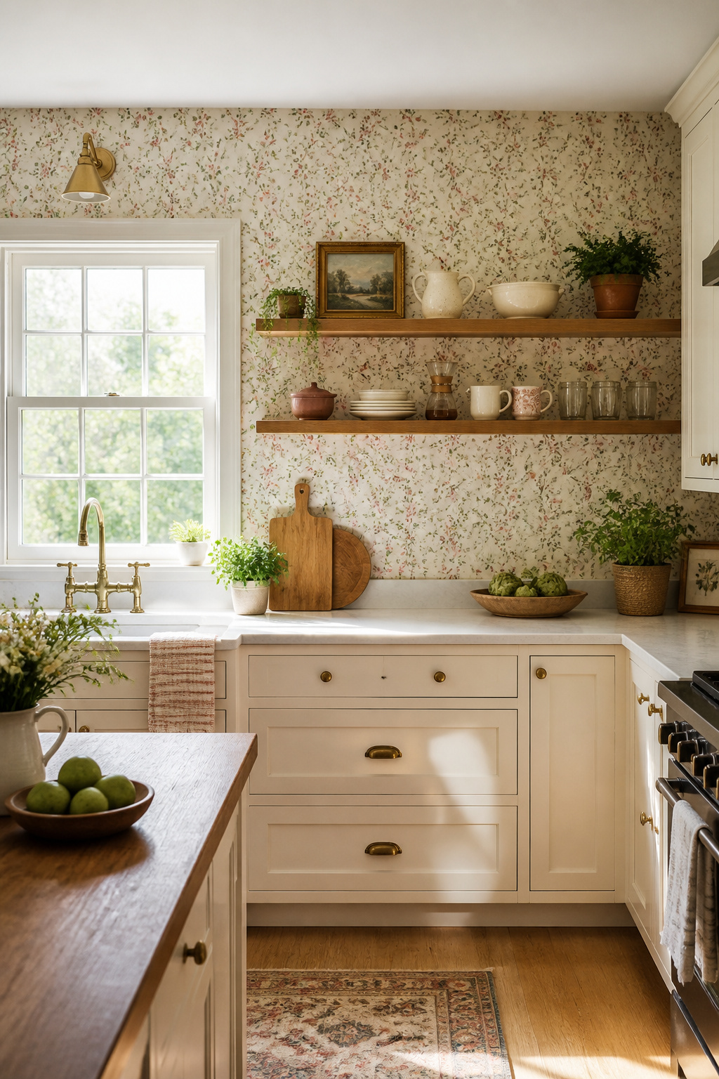
Plus, scale is the decision that makes or breaks the choice. Another thing: open-plan kitchen-diners with strong natural light can carry a larger repeat (6–9 inch blooms) on one feature wall without the pattern feeling oppressive. The most common placement is a single accent wall behind open shelving or a breakfast nook banquette this creates a clear focal point without requiring the whole room to commit. In a kitchen under 100 square feet, keep the repeat tiny under 4 inches thus the pattern reads as texture from across the room rather than competing with cabinetry.
If you’re not ready for a full wall, consider papering the recesses of open or glass-fronted cabinetry. For the splashback zone, any floral paper used there needs to be vinyl-coated and sealed at the edges with clear silicone the same finishing step used for standard tile installations. A single roll covers most cabinet interiors and delivers a considered, layered look that feels like a design decision rather than an afterthought.
2. Vintage Toile Patterns That Turn Your Kitchen Into a Story
Toile de Jouy tells stories. They became consequently fashionable with European aristocracy that within two decades they were being copied across Britain and Germany. That heritage gives toile a quality challenging to replicate with more recent patterns: it feels layered with context before a single piece of furniture is placed. The original designs pastoral village scenes, classical mythology, and everyday country life printed in a single colour on a plain ground were first produced in Jouy-en-Josas, France, from 1760 under Christophe-Philippe Oberkampf.
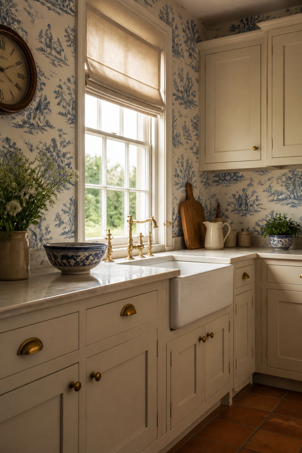
Another thing: in kitchens, the bi-tone print works because it doesn’t compete. Red and cream toile warms a north-facing room noticeably and plays particularly well with terracotta floor tiles. Blue on white suits a more formal kitchen with painted cabinets and brass hardware. Blue on cream, red on ivory, charcoal on bone each version reads from across the room as texture and colour rather than as individual scene elements, which matters where cabinetry, tiles, and appliances are already making visual demands.
The one rule experienced designers apply universally: keep every other surface plain. Plain cabinet doors, plain worktop, plain floor. Because toile’s line quality is curvy and intricate, it pairs naturally with geometric accents in adjacent spaces a ticking stripe cushion, a gingham check Roman blind and those combinations prevent it from reading as a period recreation. Toile is detailed enough that it can’t share a room with another patterned surface.
3. Bold Geometric Prints for a Modern, Graphic Kitchen Look
Kitchens are already geometrically ordered: parallel cabinet runs, rectangular tiles, straight-edged worktops, rectilinear appliances. The opportunity is to utilize geometry to introduce colour and energy simultaneously a deep ink blue hexagon print, a bold chevron in forest green and white, or a graphic diamond in black and charcoal all achieve this without requiring any other design move. Geometric wallpaper reinforces that logic rather than fighting it, and the result is a room that feels intentional rather than decorated.
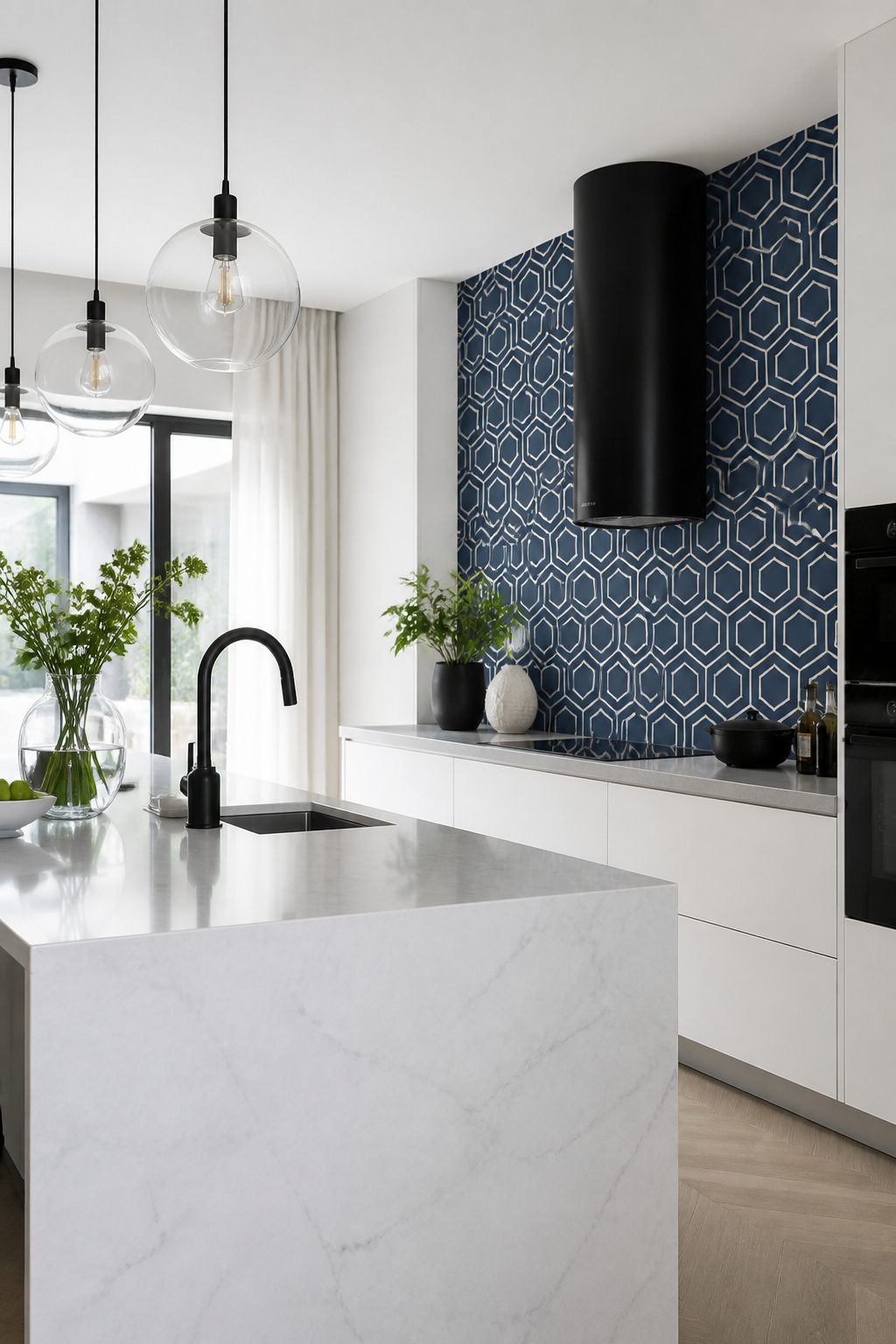
Another thing: the most practical material for kitchen geometric wallpaper is non-woven: easier to hang, removable without soaking, and most versions are rated washable. Large-scale hexagons or diamonds (6 inch+ repeat) work best on a single feature wall in kitchens with ceilings above 8 feet. Plus, fine-line chevrons and pinstripes suit compact spaces, where they register as texture and pattern simultaneously. Scale is the main decision.
Kitchen wall decor ideas from farmhouse to modern offer a useful framework for understanding how wallpaper choices interact with cabinet style. Plus, the grounding principle: keep the worktop plain. Natural stone, plain quartz, or solid timber not a patterned laminate. Bold geometry demands a calm horizontal surface as a counterweight. Geometric papers are among the most versatile they work across modern handleless cabinetry and Shaker-door kitchens equally well.
4. Delicate Watercolour Designs for a Soft and Airy Kitchen Feel
Every kitchen is full of challenging surfaces. On top of that, a watercolour-effect wallpaper provides the opposite. The blurred, paint-washed quality of the design adds organic softness that makes the whole room breathe more easily. Stone worktops, lacquered cabinet doors, stainless steel appliances, ceramic tiles everything in the room is flat, shiny, and unyielding.
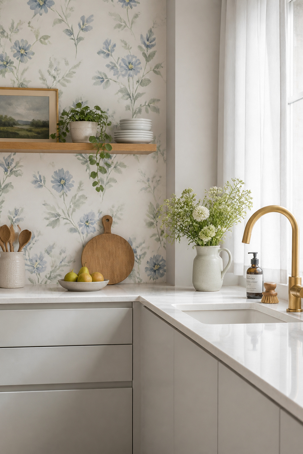
Harlequin and Cole & Son both produce well-regarded watercolour-effect ranges, using high-definition printing on textured base papers to recreate brushstroke effects convincingly. These papers produce the most of fantastic light in a way solid paint rarely does. Soft blues, dusty pinks, and sage greens are the most kitchen-appropriate colours their translucent quality amplifies in morning or afternoon light, particularly in east or west-facing kitchens that obtain strong direct sun.
The material choice matters for kitchen utilize. Avoid paper-backed watercolour papers directly behind the kettle or hob; steam can lift paper edges within weeks. On top of that, a 60cm clearance from any heat source is the rule. Handleless cabinetry in pale dove grey or warm white is the natural partner smooth door fronts allow the painterly quality of the paper to register without competition. Vinyl performance wallpaper with a thin plastic coating over the printed surface resists steam and wipes clean, making it the right call for any kitchen application.
5. Kitchen Wallpaper Inspiration: Dramatic Dark Botanicals
If any single wallpaper trend has defined the last two years in kitchen design, it’s the dark botanical. What’s more, house of Hackney’s Palmeral and Graham & Brown’s deep-ground botanical ranges are among the most specified. As kitchen wallpaper inspiration goes, this is the option for anyone who wants the room to feel genuinely different after dark. Deep emerald grounds, midnight blue backgrounds, charcoal fields printed with botanical illustration in gold, cream, or vivid colour these papers represent the clearest rejection of the pale, grey-white kitchen aesthetic that dominated the previous decade.
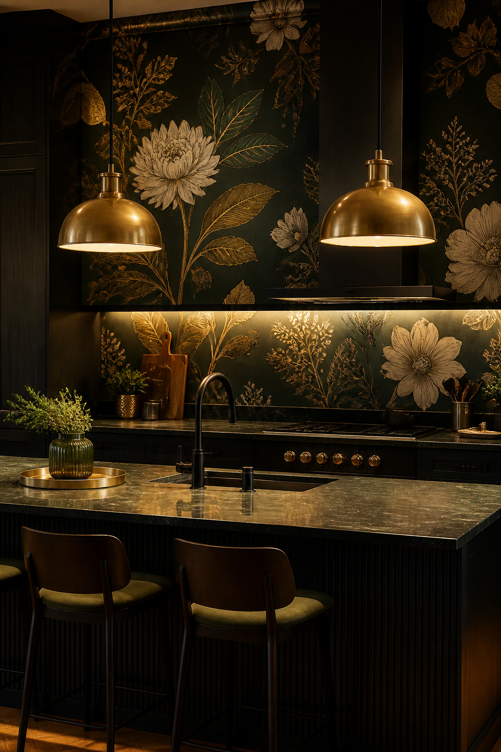
The lighting question is the critical practical consideration here. Bulb colour temperature matters: aim for 2700–3000K (warm white). Kitchen lighting design decisions made before the wallpaper goes up will determine whether the room feels dramatic and inviting or simply dark and gloomy. Dark kitchen wallpaper requires under-cabinet LED strip lights to keep the worktop functional, and pendant lights over the island or dining table to create the warm pools of light that create these papers read at their best.
Materials that work with dark botanicals almost effortlessly: brass hardware, pendant shades, and tap fittings echo the gilded tones in most botanical illustration. For cabinet colour, two approaches work: dark-green or navy cabinetry creates a tonal, enveloped look; white cabinetry makes the wallpaper pop as a deliberate contrast. Darker rooms benefit from the white-cabinet contrast approach; well-lit spaces can carry tonal cabinetry. Natural stone worktops a mid-toned granite or honed Calacatta provide material contrast that grounds the botanical richness.
6. Faux Tile and Subway Patterns That Fake an Expensive Backsplash
The argument for faux tile wallpaper in the backsplash zone is almost entirely practical: a vinyl subway tile paper costs under $35 per roll and covers a standard backsplash in 2–3 rolls, total outlay under $100. What’s more, for a rental property the maths makes even more sense the paper removes cleanly, leaving no tile adhesive residue and no lease complications. What’s more, a ceramic tile installation over the same area, including material and labour, runs $500–$1,500 or more.
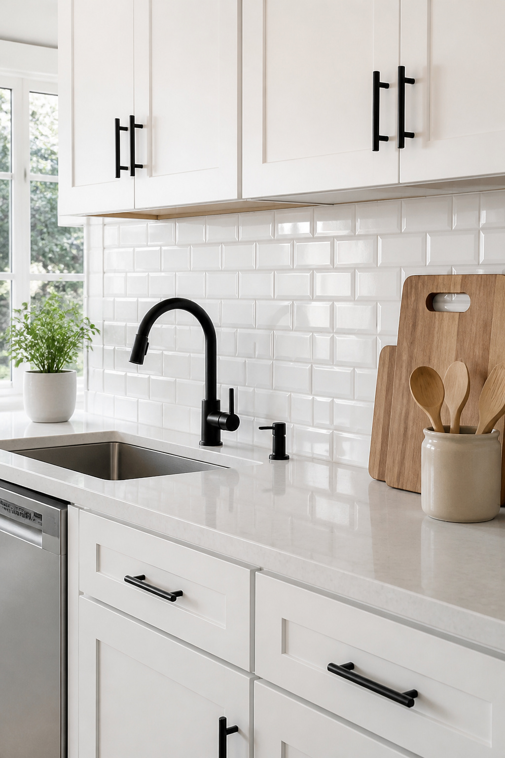
Today’s best faux tile papers are considerably more convincing than their predecessors. High-gloss vinyl reads closer to real ceramic; matte finishes can reveal themselves as print-on-paper at close range. Prepasted papers are easier to reposition during installation than peel-and-stick, which loses adhesion if adjusted more than once. For context on what a real tile installation delivers, modern kitchen backsplash ideas cover the full spectrum useful if you’re deciding whether the real thing is worth the investment. Tempaper’s tile-inspired range and Quadrostyle’s backsplash stickers both utilize 3D-embossed vinyl surfaces that create a grout-shadow effect and catch light credibly.
The installation rules: keep wallpaper at least 30cm from the hob edge vinyl cannot tolerate sustained high heat. For any non-vinyl paper applied near a splash zone, a coat of water-based varnish (Polyvine’s decorator’s varnish is frequently recommended) creates a wipeable surface. Seal all edges with a clear silicone bead to prevent moisture wicking.
7. Tropical Leaf Prints for a Lush, Maximalist Kitchen Wall
The maximalist kitchen is no longer a niche aesthetic oversized banana-leaf, monstera, and palm-frond wallpapers are genuinely mainstream now, and they’ve been that way long enough to feel confident rather than trend-chasing. At the premium wrap up, tropical prints on deep-ground backgrounds teal, forest green, near-black create the most kitchen-appropriate versions: lush without being playful. Grandeco and Prestigious Textiles both carry comprehensive tropical kitchen ranges.
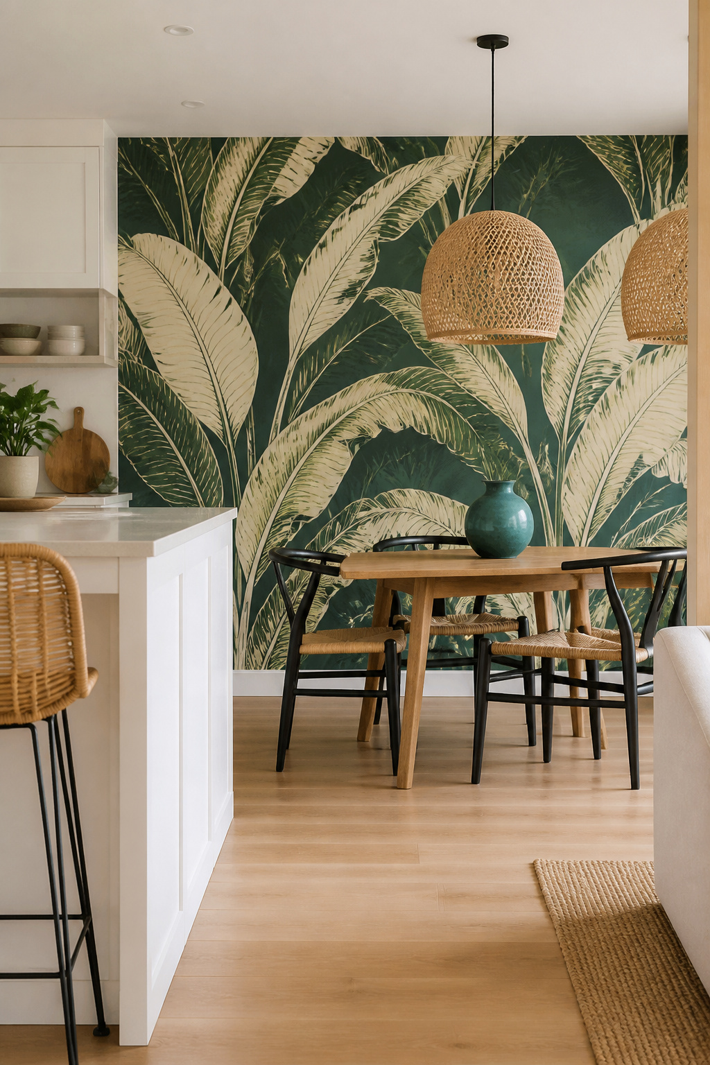
On top of that, the distinction between intentional maximalism and visual chaos almost always comes down to scale. A compact all-over tropical repeat reads as pattern in the worst sense: demanding and tiring. In open-plan kitchen-diners, applying the tropical paper only to the conclude elevation maximises visual impact for minimal material, typically 2–4 rolls. An oversized banana-leaf print with individual leaves measuring 18 inches or more reads as architectural almost sculptural rather than just busy.
One firm rule keeps a tropical kitchen from feeling chaotic: everything else must be plain. The wallpaper is the only personality move in the room. Natural rattan or cane pendant shades and bar stools share the visual language of plant-based texture without adding a competing colour. Keep accessories in colours pulled directly from the wallpaper one teal vase if the paper has teal leaves, one warm terracotta bowl if the ground is amber. Plain cabinet doors, plain worktop, plain floor.
8. Striped Kitchen Wallpaper Ideas to Heighten a Low Ceiling
The visual science behind vertical stripes is well-established: the eye follows a continuous line upward, extending the perceived height of the wall. Among all the kitchen wallpaper ideas in this list, stripes are probably the most reliably functional the aesthetic benefit is inseparable from a practical optical effect. A kitchen with a standard 2.4m ceiling can read closer to 2.6m in the brain’s estimation with nothing more than a vertically striped wallpaper from floor to ceiling.
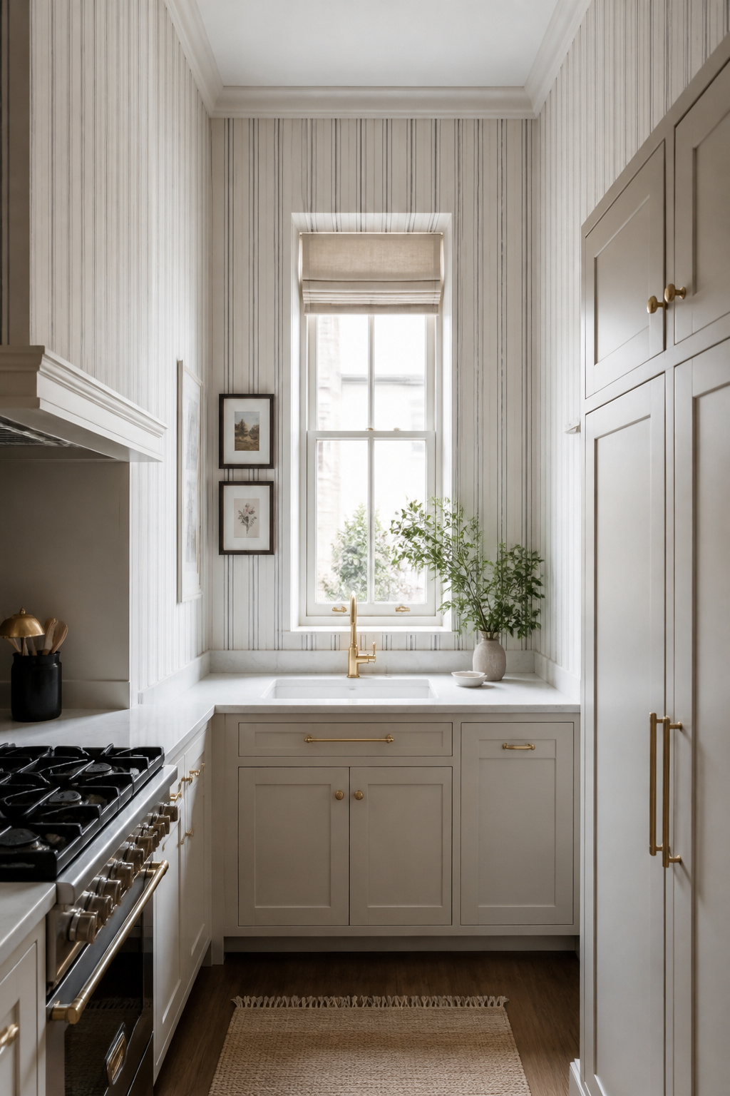
For modest or low-ceilinged kitchens, reading about modest kitchen decor ideas alongside stripe options helps clarify what combination of tricks delivers the most impact stripes alone are powerful, nevertheless paired with reflective surfaces and fantastic lighting, the height-gain illusion becomes remarkable. Farrow & Ball produce ticking stripe papers specified consistently in professional kitchen projects. The most kitchen-appropriate stripe width is 1–3 inches; the classic ticking stripe a fine dark line on cream delivers the height illusion while remaining visually quiet.
In a narrow galley kitchen, horizontal stripes on the short wrap up walls widen rather than heighten the perceived space. The one installation rule that holds consistently: run stripes floor to ceiling without interruption. Any break a dado rail, a paint-line change, a shelf interrupts the upward eye movement and defeats the purpose entirely. Wide horizontal stripes (6–8 inches) craft a bold graphic statement; narrower ones (1–2 inches) read as refined texture.
9. Scandi-Minimalist Patterns for a Clean, Uncluttered Look
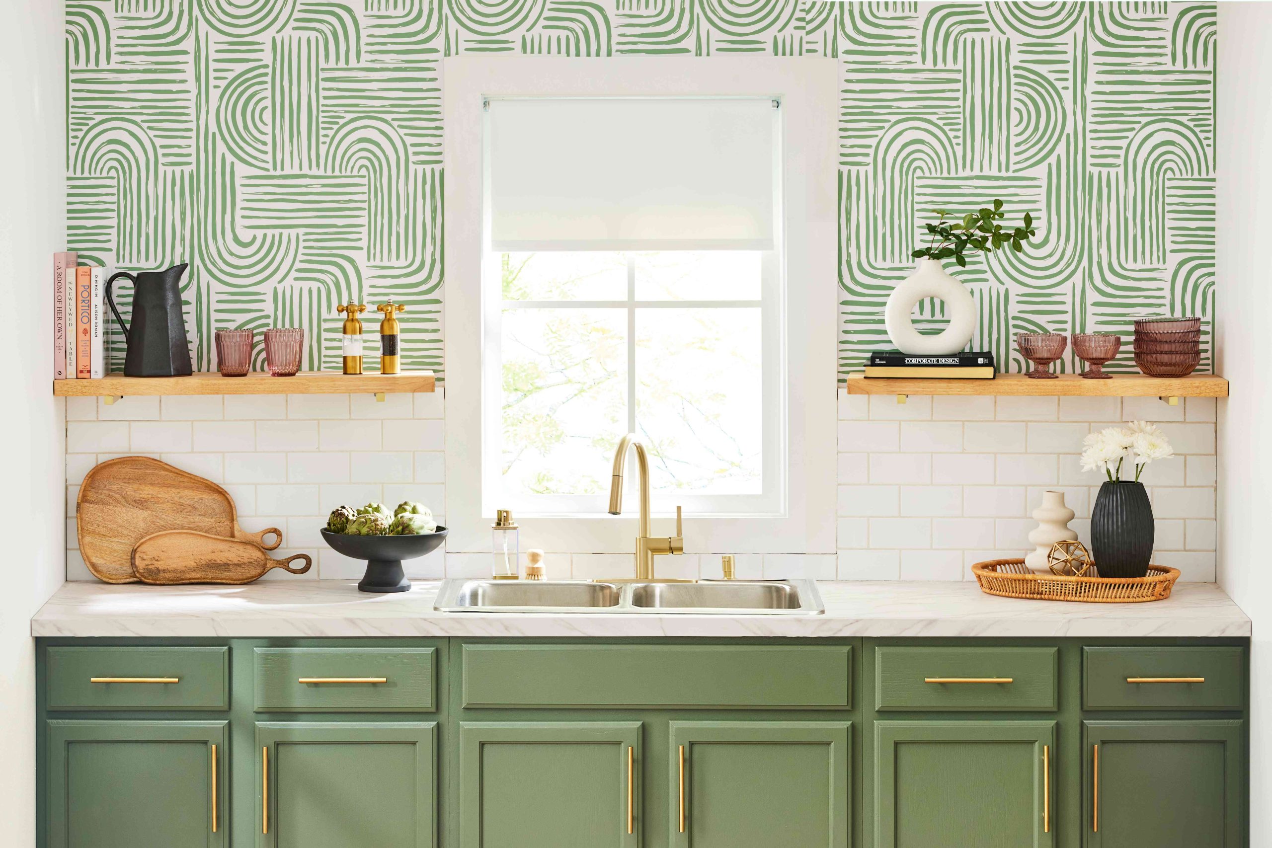
Scandinavian wallpaper design is founded on restraint. The best Scandi kitchen wallpapers are the ones you notice when you look closely and forget about when you don’t. They’re present in the room without demanding to be its subject. The motifs are modest-scale a simple botanical sprig, a repeating diamond, an abstract brush mark and the palettes are soft: warm whites, muted greys, sage green, dusty blue, pale ochre.
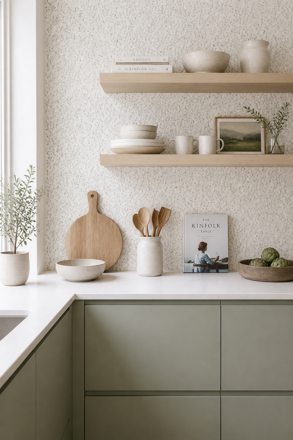
Swedish houses Boråstapeter and Sandberg Wallpaper produce the most respected ranges in this category used extensively in Nordic country homes and increasingly in UK and US kitchen renovations. Tone-on-tone versions a slightly darker version of the ground colour forming the pattern add wall texture without introducing a second element that needs visual managing. What they do consistently well is linen-texture paper with a single quiet repeat: a botanical sprig, a minimal geometric, a tonal stripe.
The design philosophy of Scandi kitchens is one of careful accumulation. IKEA kitchen systems pair particularly well with Scandi-pattern wallpaper the same underlying design language runs through both, and the combination delivers a cohesive look at a realistic budget without custom cabinetry. Handleless cabinetry in white, pale grey, or sage green; open shelving in light ash or birch; a few considered objects on display rather than a full collection.
10. Grasscloth and Textured Wallcoverings That Add Natural Warmth
Every kitchen accumulates flat, shiny surfaces, and grasscloth is the antidote. No two sections of a natural fibre wallcovering look identical; the weave creates subtle variation across a single wall that gives it the character of a handmade material. Made from sustainable natural fibres sisal, jute, seagrass, cork woven over a paper or fabric backing, genuine grasscloth adds tactile depth and tonal variation to kitchen walls that no flat-printed paper can replicate.
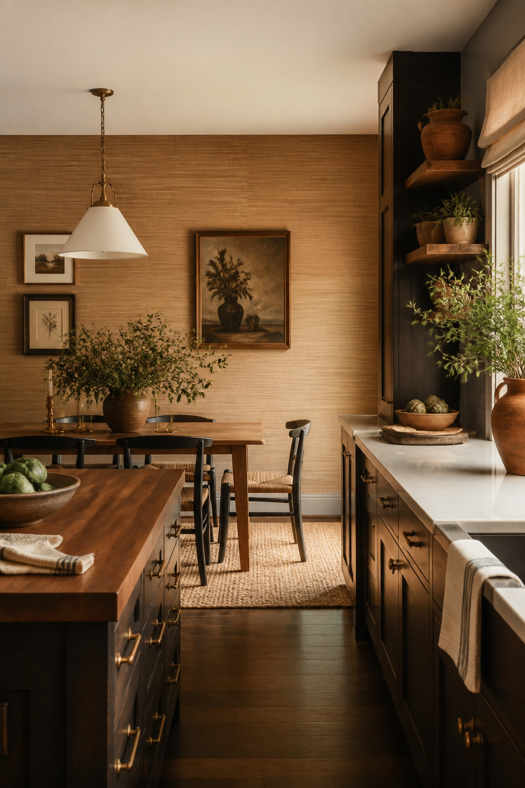
The practical reality of natural grasscloth in kitchens requires honesty: it’s porous and absorbs moisture, cooking grease, and odour. For main kitchen walls near the hob and sink, vinyl-backed faux grasscloth is the rational substitute. The embossed vinyl surface mimics natural sisal well enough for the ambient visual effect, while the vinyl coating makes it wipeable and steam-resistant. At the budget finish, embossed grasscloth papers kick off around $30–35 per double roll. It belongs away from the cooking zone a dining wrap up, a butler’s pantry, or a breakfast nook.
The grounding principle for styling grasscloth kitchens: dark-stained wood cabinetry, antique brass hardware, and linen blinds all speak the same warm, layered material language. For a kitchen-diner where the dining conclude needs enough formality for evening entertaining, classic striped grasscloth alternating woven lines of slightly different tone adds a tailored quality that plain paint simply cannot provide. Another thing: a rose tan or warm beige grasscloth with terracotta or warm gold accessories creates the gathered, communal atmosphere that suits a family kitchen well.
11. Art Deco Motifs for a Glamorous Statement Kitchen Wall
Art Deco emerged in 1920s Paris and became the defining decorative style of the 1930s precision, geometry, luxury materials, and the celebration of modernity. Graham & Brown and Milton & King are the primary suppliers for quality Art Deco kitchen wallpaper, with fan motifs, stepped geometric shapes, and gold-accent papers across both ranges. Those qualities translate naturally to a well-designed kitchen: the room already runs on precision and functional order, thus adding its most glamorous visual language doesn’t feel out of place.
Where Art Deco Works Best in a Kitchen
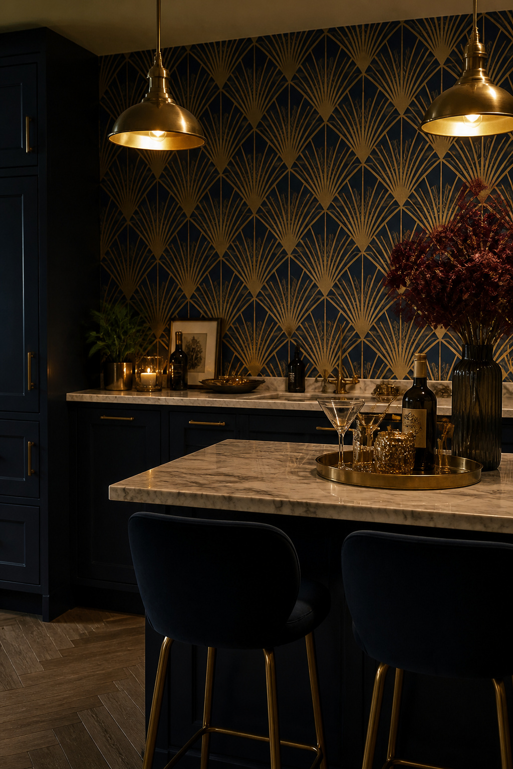
Art Deco wallpaper earns its keep in kitchen contexts as an accent wall behind a bar area, drinks station, or attached dining space somewhere the glamour matches the social function. Metallic papers read differently across the day muted in morning daylight, highly dramatic under warm artificial light after dark which suits a kitchen-diner used heavily for entertaining. Applied to the whole kitchen, it can become theatrically relentless; on one wall behind a pendant-lit dining table, it creates the kind of evening drama that makes guests feel they’ve arrived somewhere considered.
Completing the Art Deco Scheme
Brass or antique gold fixtures, taps, and pendant shades are the natural hardware companions they echo the metallic warmth of the wallpaper’s accents without effort. White cabinets work, nevertheless dilute the glamour. A marble or terrazzo worktop completes the 1930s luxury association. One firm note: avoid rose gold hardware with Art Deco wallpaper the warm, blush metallic clashes with the richer, deeper gold the style demands. Dark-painted cabinetry navy, forest green, deep charcoal with brass handles creates the most resolved Art Deco kitchen scheme.
12. Marble and Stone-Effect Kitchen Wallpaper for a Luxe Look
The visual gap between high-quality stone-effect wallpaper and real marble has narrowed considerably. The range of available colours has expanded beyond classic white and grey into contemporary blues, pinks, and gold marble variants that aren’t feasible in real stone without extreme cost. Modern kitchen design ideas that incorporate stone-effect surfaces as part of a broader material palette reveal just how convincing the combination can be when applied with care. The best current options Giffywalls’ faux stone range, Sandberg Wallpaper’s marble-effect collection, and Milton & King’s smooth satin-finish papers leverage high-definition printing on heavyweight textured papers that recreate marble veining credibly at normal viewing distances.
Best Locations for Stone-Effect Paper
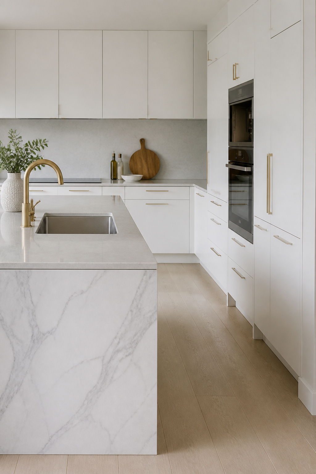
Island wrap up panels are the ideal location a vertical surface seen from across the room, where the pattern reads at its best and isn’t exposed to cooking steam or direct water. As a ceiling treatment in a kitchen-diner with high ceilings, grey marble-effect wallpaper creates a visual anchor overhead that makes a tall space feel more intimate. Behind open shelving on a non-cooking wall, stone-effect paper creates the impression of a stone wall behind displayed ceramics.
Coordinating Paper With Real Stone
If the kitchen already has real stone worktops, match the paper to a complementary rather than identical vein colour exact matching looks like a mistake rather than an intention. Livettes Wallpaper offer stone-effect papers in three materials peel-and-stick, commercial grade textured, and traditional non-woven therefore you can choose the durability level that suits each kitchen zone. Never utilize stone-effect wallpaper directly behind the sink or dishwasher. Using stone-effect paper on vertical surfaces alongside real stone horizontals (worktop, floor tile) requires colour temperature consistency both materials should sit in the same warm or cool range.
13. Hand-Painted Mural Style Prints for the Adventurous Cook
A mural wallpaper is a different proposition from a repeating print. Another thing: the absence of a pattern repeat means the design is composed specifically for its wall, with elements balanced and proportioned for the actual space rather than being a tile of a pattern applied to it. There’s no repeat: the design runs continuously across the width and height of the wall as a single image, installed as consecutively numbered panels typically 3–8 panels for a standard kitchen wall.

Ready-Made vs. Custom Murals
Suppliers including Photowall, Rebel Walls, and Murals Your Way all price murals per square foot, with a 3m × 2.5m kitchen wall costing roughly $200–500 depending on the design tier. For most kitchens, Rebel Walls’ ready-made catalogue delivers full impact without the commission complexity. Their Canopy, Blossom, and Forest Bathing designs are among the most-specified kitchen choices. Custom murals where you supply the artwork and the supplier prints at wall scale carry a premium of 40–100% over catalogue designs and a typical 5–10 day turnaround.
Subject Matter That Works in Kitchens
Food and botanical subjects are the most thematically coherent mural choices oversized vegetable illustrations, orchard scenes, and botanical specimen prints connect to the room’s culinary purpose in a way that feels earned. Plus, abstract colour-field murals large washes of a single warm or cool tone deliver mural-scale impact without representational commitment and age better stylistically over time. Always plan cuts around sockets, windows, and extractor housings before ordering murals cut around features look wrong when the cut isn’t designed in. On top of that, misty forest or olive-grove murals create the impression of a window onto a garden from an interior kitchen without natural light.
14. Heritage and Archive Prints That Pair With Antique Kitchenware
Archive wallpaper houses keep designs over 150 years old in continuous production. Plus, the most celebrated kitchen choice from the archive is the Strawberry Thief a design Morris created in 1883 after watching thrushes steal fruit from the kitchen garden at Kelmscott Manor, a detail that gives it an unusually literal culinary connection. William Morris & Co., Sanderson, and Colefax and Fowler maintain archives from which they produce kitchen-appropriate botanical, bird, and floral designs updated for modern paintwork and appliances.
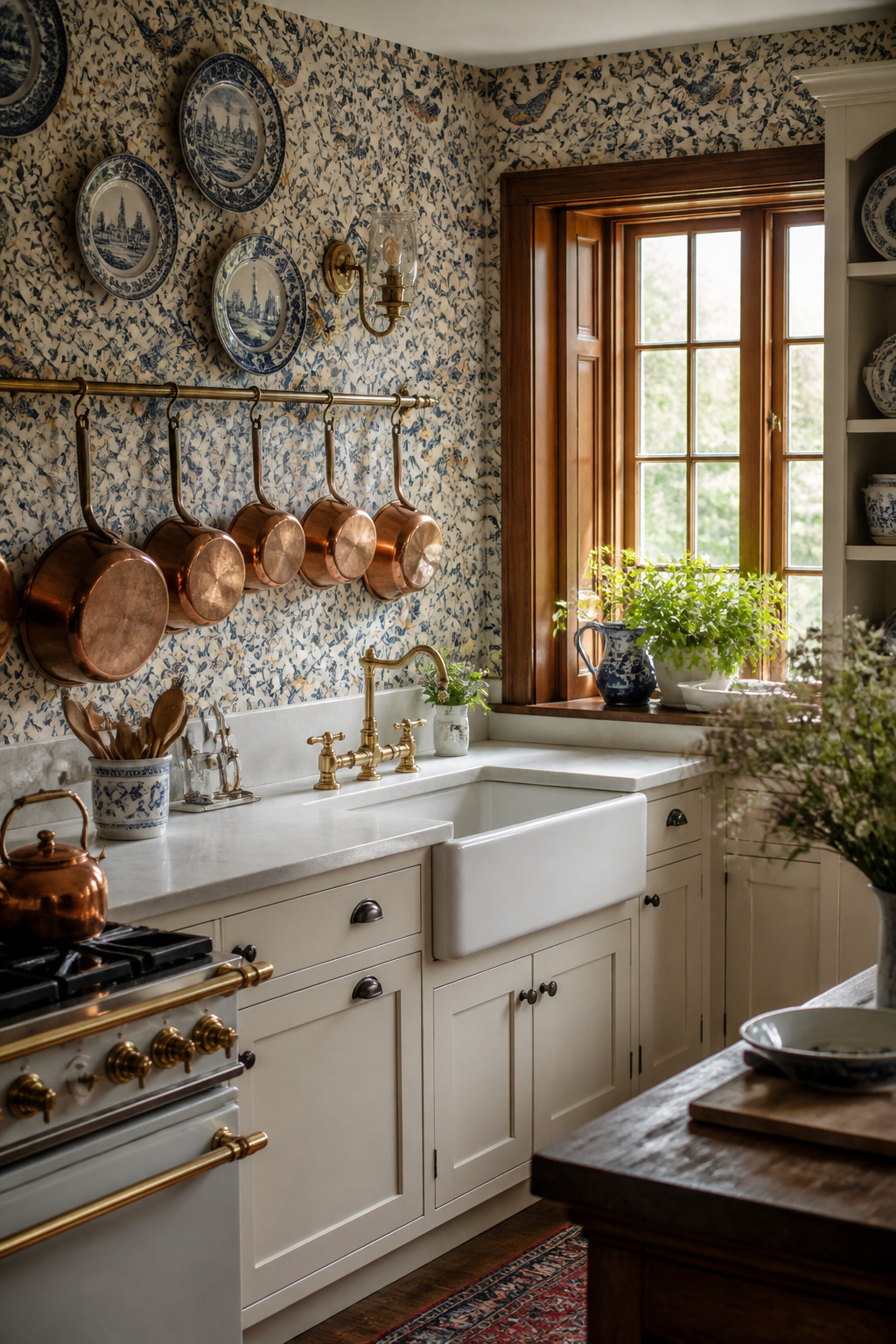
The practical challenge of heritage wallpaper in a working kitchen is managing the relationship with modern appliances. Matte-black appliances sit more harmoniously with archive prints than stainless steel, which introduces an industrial reference the heritage pattern can’t absorb. The most effective approach is to treat appliances as visually invisible integrated panels for the dishwasher and fridge, a black or anthracite range cooker that reads as furniture rather than machine, a plain white Butler sink.
The accumulated display antique creamware plates, copper pans on butcher’s-rail hooks, vintage kitchen moulds on open shelves is the natural companion to heritage wallpaper. Plates smaller than 8 inches tend to disappear into the design. Wire racks, spice shelves, and butcher’s-rail hooks are all appropriately period without turning the kitchen into a museum. However, restraint still applies: anything displayed against a busy background needs to be large enough to register as distinct from the pattern behind it.
15. Peel-and-Stick Kitchen Wallpaper Inspiration for Renters
Peel-and-stick wallpaper has improved more in the last five years than in the previous twenty. The current market leaders Tempaper, Chasing Paper, Rifle Paper Co., and Spoonflower are fundamentally different products. This is genuinely useful kitchen wallpaper inspiration for the renting majority, not a compromise category. The early versions were thin PVC sheets with unreliable adhesive that either fell off the wall or took the paint with them.

Choosing Quality Peel-and-Stick
The key quality differentiator is material weight. Tempaper was rated the top overall peel-and-stick brand in independent testing, praised for ease of application, durability, and clean removal from painted walls. Rifle Paper Co.’s non-woven papers employ a repositionable adhesive that stays firmly in place under normal conditions yet removes cleanly. What’s more, chasing Paper uses a poly-woven fabric backing that mimics the feel and opacity of traditional wallpaper; budget brands leverage thin PVC that shows seams and tears on removal.
Best Kitchen Applications for Renters
The safest application zones are an accent wall away from the cooking area, the inside of glass-fronted cabinet doors, or the back panel of open shelving all locations away from steam and direct heat. For creative kitchen wallpaper applications beyond the obvious, cabinet interiors are the most overlooked: a single roll covers most open shelving back panels and leaves zero visible trace on removal. A peel-and-stick faux tile backsplash can work in the splashback zone if applied to a clean, primed surface with edges sealed in silicone however avoid placing it directly behind any open-flame or high-heat hob.
Removal That Actually Works
The most reliable removal technique is slow and warm: utilize a hair dryer on a low setting to gently warm the paper as you peel from a corner. Before full installation, always test a modest section on an inconspicuous wall area behind the fridge, inside a tall cupboard for 48 hours. The highest-risk combination is flat or eggshell paint on a wall repainted within the last two years; semi-gloss on paint three or more years old has the best removal track record. Heat softens the adhesive and dramatically reduces the chance of lifting paint.
Finding Your Kitchen Wallpaper Inspiration: Matching Pattern to Personality
The choice of kitchen wallpaper inspiration comes down to four practical filters that narrow the field quickly. Another thing: second, cabinet style: handleless modern cabinetry suits geometric and watercolour papers; Shaker or painted wood cabinets suit florals and heritage archive prints. Third, natural light levels: dark botanical and Art Deco papers need either wonderful daylight or strong artificial lighting. Fourth, household lifestyle: a busy family kitchen with young children needs washable vinyl paper; a couple’s kitchen has more material latitude. First, room size: tiny kitchens need restrained patterns or texture rather than large-scale prints, and stripes and watercolours tend to work harder than oversized botanicals.
Starting Smaller Than You Think
If the whole-wall commitment feels daunting, begin smaller than you think you need to. Cabinet interior wallpapering (the back panel of open shelves or the inside of glazed doors) is the lowest-commitment application and an excellent way to trial a pattern at kitchen scale before ordering 10 rolls. The butler’s pantry, the island wrap up panel, or a window recess leverage minimal paper often a single roll or less and create contained features that are straightforward to revise.
The Sample Step That Prevents Expensive Mistakes
The sample step is non-negotiable regardless of which direction you choose. Kitchens change their character dramatically across a day, and a paper that looks perfect in a supplier’s photography may behave completely differently in your specific light conditions. Most reputable suppliers Sanderson, Graham & Brown, Tempaper, Rifle Paper Co. offer samples for $5–15. That’s the most valuable money spent in any kitchen wallpaper project, and it almost always prevents a much more high-end mistake. Order at least an A3 sample, tape it to the actual wall position not flat on a table and live with it for a full week: morning light, midday, and evening lamp light.